


Mini Specialisation Project Brake down
- 1012433

- Nov 26, 2018
- 3 min read
Updated: Dec 13, 2018
The point of this project and the deliverable's we where required to submit where very individually based, as we got to select an area of our own interest to further research.
My Projects
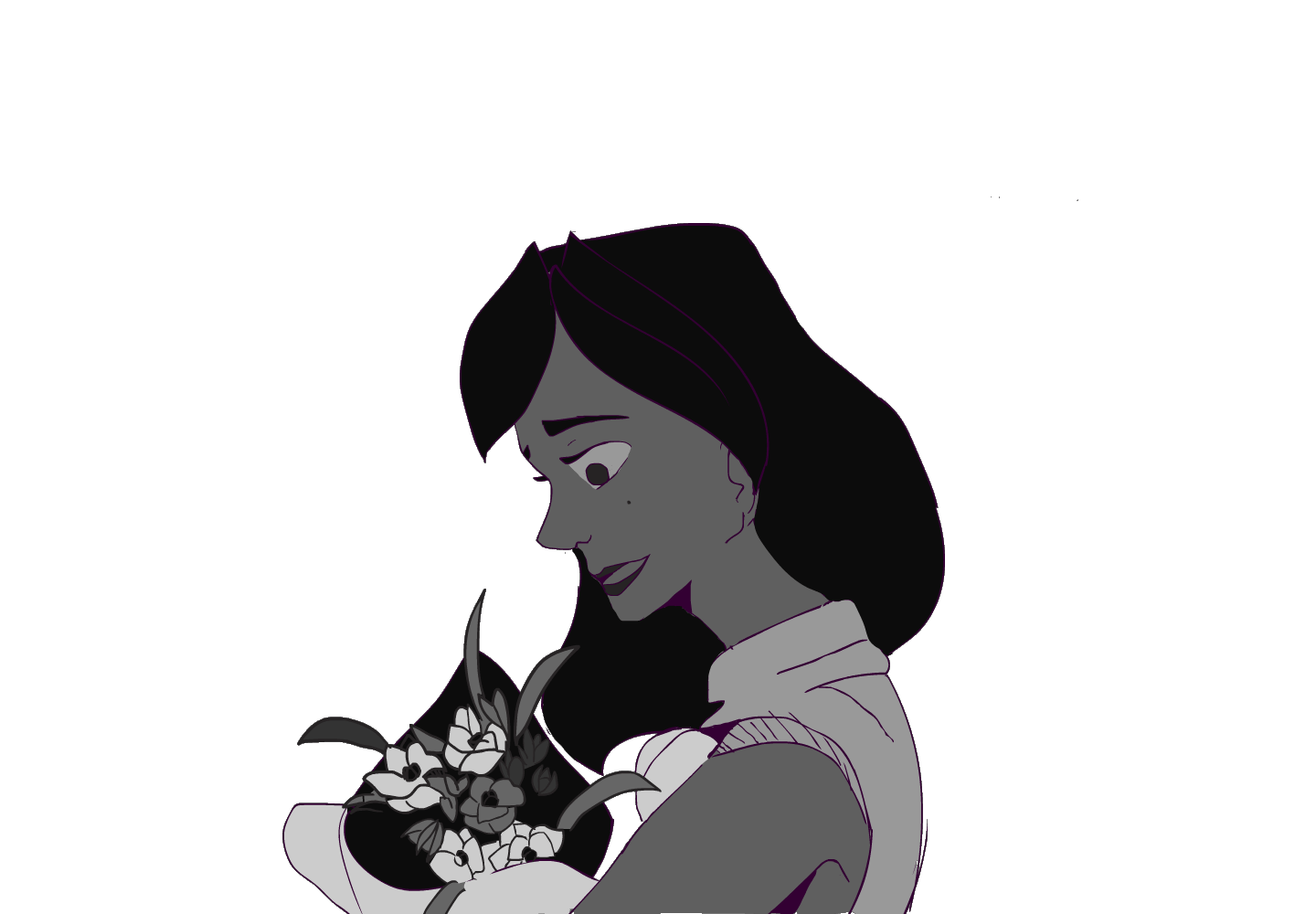
Pantomime Acting
Research
For this specialisation, research was important as it helped me figure out where to be improving. As a first glance had me feeling overwhelmed by the possibility of areas to look at. So i started with some recommended books. As our facilitators kept telling us about was Richard Williams’ the animator's survival kit. Followed by two PDFs which explained colour theory and ways in which to go about using them.
Survival Kit
The book had a lot of quality tips to provide. The first thing that it did was remind me to always think about why i animate. About bringing still images to life. We always want to make these pictures move. “The only limitation i animation is the person doing it. Otherwise there is no limit to what you can do. And why shouldn’t you do it?”
Drawing is crucial - drawing should be second nature. Then it gives the animator time to concentrate on the movement, actions and timing to give the performance life. Animation is usually a collaborative effort, so with life drawing. Its something one does not choose to do in their spare time. But it’s a skill which helps forms the fundamentals for drawing. A quote that i like is “if you can’t draw- forget it. You’re an actor without arms and legs” its blunt but true. But what i love it that this book encourages you to learn to draw. To improve.
The next piece that the book taught me was timing and spacing in the timeline. The example they use is a bouncing ball. And while we have done this exercise each trimester it is always good to come back and make sure that i’m not just reworking wrong habits and enforcing them.
[include images of spacing]
Colour theory
So first is, what’s colour theory? And how can it be used to enhance our drawings/pictures. It allows us to keep users attention and influence one's viewers’ first-impressions.
Colour wheels - these are all the possible combinations of colours that could be selected. Different wheels are separated into primary, secondary and tertiary. After this is complementary, which are colours the exact opposite of the colour wheel. Split complementary is then using the two colours that are next to each complementary. After this is tertiary triad. All three options provide a different range of colours that are appealing to the eye.
Colour schemes - these are ranges that can be picked after selecting a colour, which could be included warm, cold and cool. It was something i was already aware of but after reading further about the intensity. It let me think beyond my favoured choice of darker and saturated tones.
Lighter tones have very little colour mixed into these shades, making them almost white. These colour evoke feelings of airiness and openness.
Pale colours are also mixed with a large amount of white, feel because of their cooler feel. They are now commonly seen as pastel tones and can be considered romantic and gentle.
Bright is often vivid colours that are pure and “jump” off the page. They can sometimes be confronting and bulking. They add energy to ones work.
Lastly is dark tones, strong and sober colours fill up that space. They are good for creating a contrast against lighter colour and can give off the feelings of tradition.
Choosing colours -
You need to think about the project and which colours would work best for a project. What is the mood you want to set? What colours are a must?
Four steps that could help choose colours could be whittled down to
Defining the goal of your project.
Choose a colour that fits that mood.
Use the colour wheel to make a palette.
Edit and scale down
The second PDF which explained colour theory was a lot wordier and so i only recorded segments of it rather than fill an entire blog posts rewording it.
Using video/reference
Framed Ink
PRACTICE
With this background research done i then moved onto actually drawing out my animations, i split my work load up to creating a draft a week for five weeks. From there i selected two i liked and extended the two seconds further.
Animations that i created are based off these prompts:
Dress spin
Ball bounce
Lip sync
Standing up
Walking
Feedback on each one then transitioned my next iteration to;
Appraisal
What i found worked was…
Future lessons and goals that this specialisation has taught me ….


Comments